

VivaKi Branding
Art Direction ∙Branding & Strategy ∙ Campaigns ∙ Print
VivaKi is part of Publicis Groupe, the world's third-largest communications group, focused on emerging technology, media distribution strategy, audience aggregation, and content. The logotype's letterforms fold and shift shape — a literal representation of media in motion, built for a company whose whole job is staying ahead of a market that never sits still.
The system expanded into a full toolkit of color-coded logos, each one representing a different part of VivaKi's business.
Designed at Faust

The logotype for VivaKi, VX and VOS is inspired by the constant movement of media and information. The folding and form-shifting of its letterforms represent VivaKi’s dynamic maneuvering in the everchanging market.

VOS is organized as a hub and spoke model for the distribution of new solutions and practices, and access to technology and data.

VX is an agile buying/trading and partnerships operation supporting the media brands in Publicis Groupe’s top markets.

The typographic concept extends to Vivaki's products—a suite of Ad Tech solutions that connect advertisers to consumers across all digital media channels.



Multiple color options for business cards.


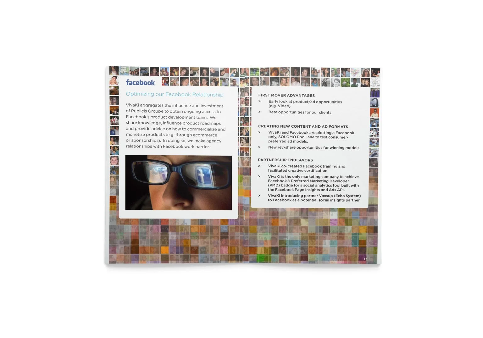
The new brand book explains the evolution of the brand.

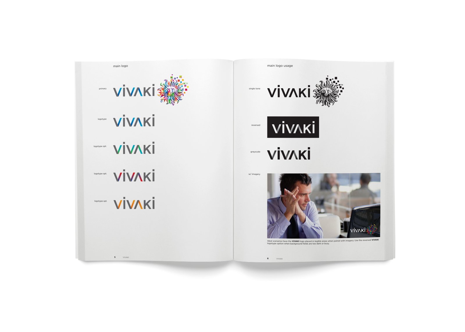


Brand guidelines offer templates and instructions for the new assets.