

Uptake Design System
Product ∙ Strategy ∙ Web
The Uptake Design System serves as a comprehensive set of standards encompassing brand, visual, user experience, and technical specifications for the development of Uptake applications. It offers a scalable framework that enables the swift creation of consistent, efficient, and valuable enterprise applications. Comprising reusable elements, components, and patterns, this adaptable and scalable system can be easily implemented across all Uptake product teams, effectively reducing technical debt.
The documentation site, designed for internal use, was collaboratively developed with input from product owners, developers, and designers. It includes essential resources such as design principles, best practices, accessibility guidelines, templates, and code.
In addition to overseeing and managing the Uptake Design System, including the formulation of design principles, I played a key role in leading and facilitating the development of the company's vision and mission statement. This involved conducting workshops across various departments within the organization.
Designed at Uptake


Design Principles
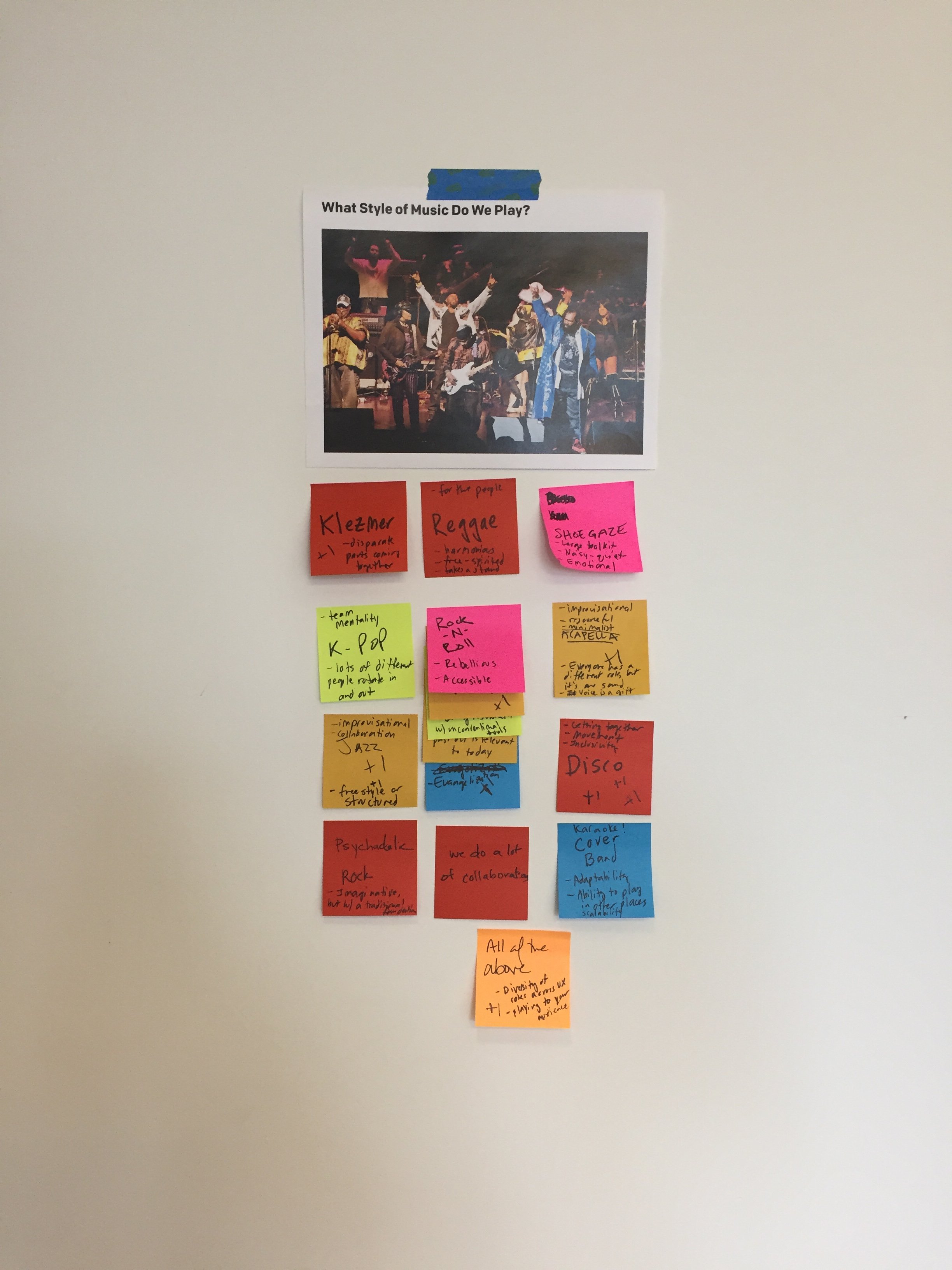
Before we could even start to think about a design system we needed to align on design principles. As a fledgling design team operating within a rapidly expanding startup and navigating various business sectors, we recognized the necessity of establishing core values or principles to guide us when grappling with questions about the user experience. With a cohort of newly onboarded designers, I proposed a vibrant team-building initiative—a playful abstraction workshop—as a means for everyone to familiarize themselves with each other.
The premise was straightforward: we sought to define the nature of our design team by answering the abstract question, "What band are we like?" Through a series of imaginative inquiries such as "What style of music do we play?" and "With which other bands do we share the stage?" we delved into understanding each other's strengths and our collective purpose within the company.
The exercise proved exceptionally impactful, fostering strong bonds and friendships among team members who hadn't previously collaborated. This shared exploration of values and ideologies became a powerful catalyst for connection.
Upon completing the exercise, we clustered similar concepts and distilled the information into a few key principles. Collaborating with our content strategy team in the UX department, we articulated these six design principles. They became our compass, our shared truth—guideposts steering the entire team in unison through the design process.
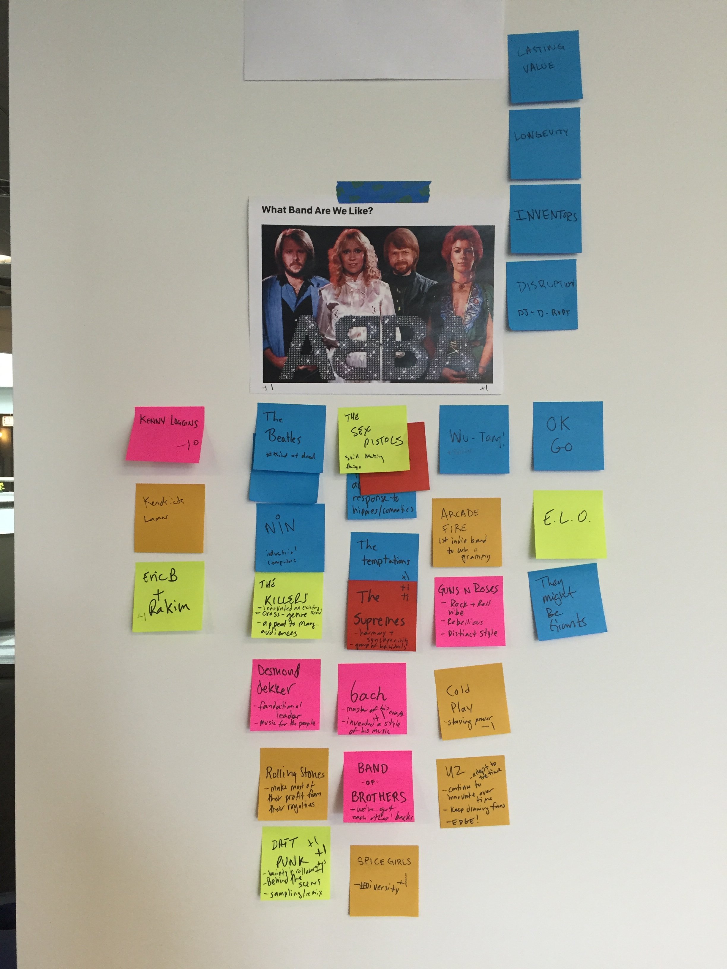
Images from the Abstract Workshop for Design Principles


Uptake UI inconsistencies across products.
Stakeholder Support
To gain stakeholders' support, we aimed to demonstrate the crucial need for a design system. One of our initial actions involved conducting a comprehensive design audit across all our products. This audit focused on examining the diverse utilization of design elements, components, patterns, and templates by different teams within our design department. We discovered significant discrepancies in our UI among products, ranging from variations in color and font sizes to discrepancies in button shapes and functionalities.
We demonstrated to our stakeholders that implementing a design system would empower our designers to concentrate on solving user problems efficiently, saving both time and resources. This shift would redirect their efforts from cataloging existing systems and inadvertently introducing more inconsistencies across products.

Design System Education
After securing buy-in from stakeholders, the next step involved educating the company on the transformative impact of a design system on their work. I undertook this through a series of company-wide presentations and engaged in one-on-one discussions and interviews. This approach aimed to gain a deeper understanding of the evolving needs within different sectors across the company.
Design System Strategy
We conducted several workshops to enhance the understanding of the benefits of the design system among our internal users. Simultaneously, these sessions served to deepen our comprehension of their needs, guiding our approach to design tailored solutions.
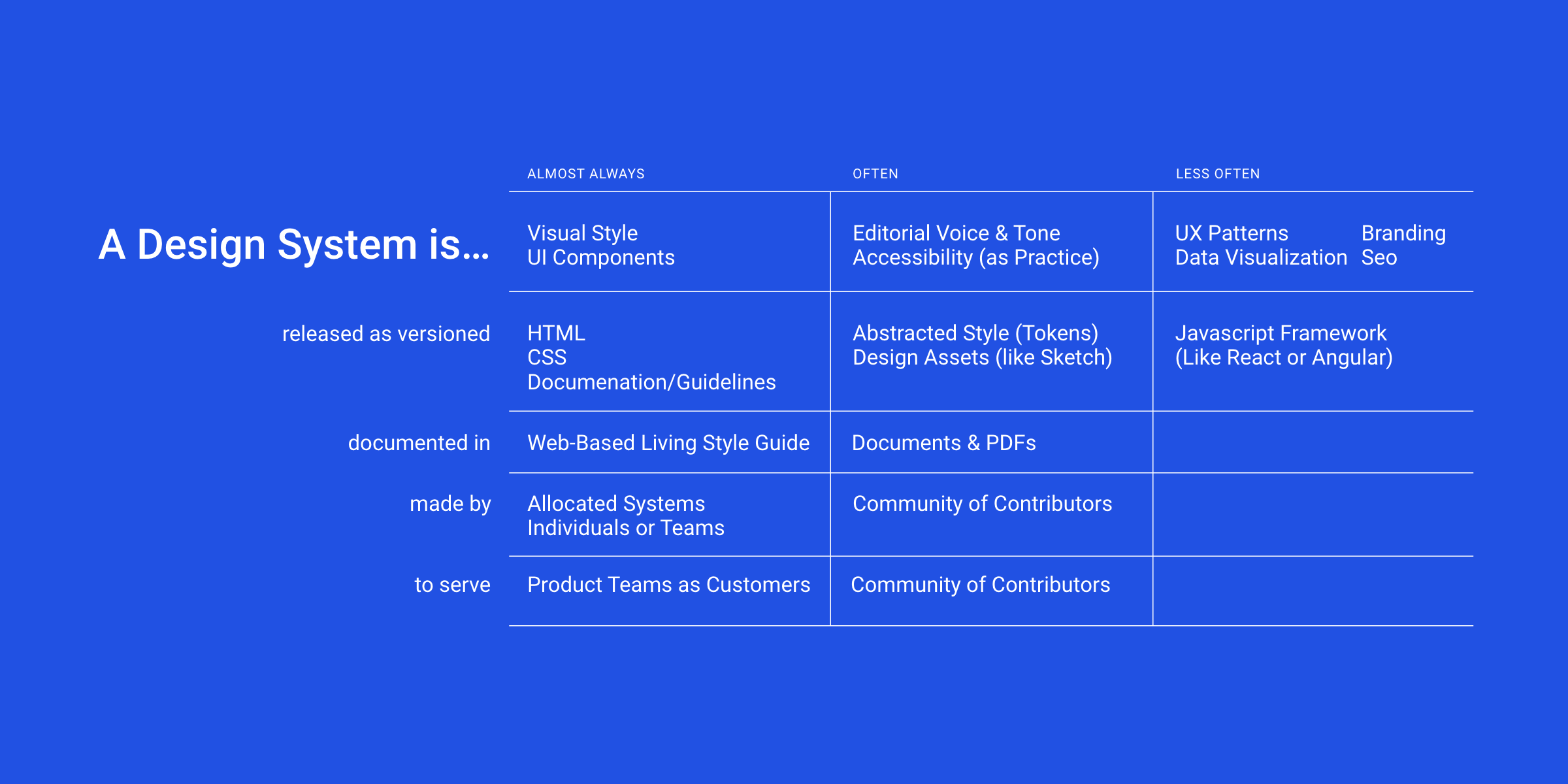
In a designated design parts workshop, we invited a curated group comprising product owners, developers, interaction designers, visual designers, design researchers, brand designers, and stakeholders. During this session, participants completed a specially crafted worksheet. This worksheet prompted them to identify and prioritize the components of the design system that were most pertinent to their work. Through this collaborative effort, we established a shared understanding of the essential components to prioritize in our design system implementation.

Goals & Benefits of a Design System

Design System Parts Worksheet
Design System Team Model and Roles
With a clear understanding and prioritization of the tasks at hand, we set out to establish a team model capable of meeting the ambitious timeline outlined by our stakeholders. Given the imminent launch of new products and the desire for cohesiveness, swift action was imperative.
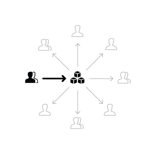
After researching various models, ranging from the solitary to the federated, we concluded that a centralized model would be the optimal starting point. The decision was made to transition to the federated model as the system matured beyond its infancy.
The centralized model facilitated the dissemination of design language, components, and patterns across a diverse portfolio. It also allowed us to cater to multiple product teams without being influenced by the priorities of any specific product. This approach enabled us to identify opportunities, gather requests to enhance the library, and establish practices and processes for validating emerging design.
To meet our aggressive deadline, we determined that a reasonably sized team would be necessary. Importantly, team members' commitment to the design system could range from 25% to 100%, depending on their roles. This flexibility also allowed us to operate somewhat like a federated model, enabling designers to bring insights from other products back to the design system and implement those learnings effectively.
Team Model: Solitary

Team Model: Centralized

Team Model: Federated

Design System Team & Commitments
Design System Process
Our well-defined workflow has fostered a shared understanding within our team regarding the scope, reviewers, tools, and the criteria for completion at each stage. This structured process has led to enhanced collaboration, accelerated delivery, and the consistent delivery of features that resonate with our products. The workflow revolves around a straightforward process of discovery, design, build, documentation, and publication.
Discovery involves clarifying the potential and relevance of a new feature, determining whether it should be pursued. Design focuses on finalizing various variations, states, and dimensions at a high fidelity level, providing the necessary foundation for Build, whether it involves visual style, UI components, or documentation. Build entails the codification of HTML, CSS, JavaScript, and other code. Documentation, rather than instructing what to build, focuses on communicating what has been built and how to use it. Once documentation is complete, it is migrated to the publishing platform for release.
Although the workflow suggests a sequential order, it doesn't imply a waterfall approach where subsequent steps only commence after their predecessor concludes. Instead, it's common for steps such as Design, Build, and Documentation to be conducted simultaneously, even if one aspect is driving the primary focus at any given time.


Creating the Design System
Our well-defined workflow has fostered a shared understanding within our team regarding the scope, reviewers, tools, and the criteria for completion at each stage. This structured process has led to enhanced collaboration, accelerated delivery, and the consistent delivery of features that resonate with our products. The workflow revolves around a straightforward process of discovery, design, build, documentation, and publication.
Discovery involves clarifying the potential and relevance of a new feature, determining whether it should be pursued. Design focuses on finalizing various variations, states, and dimensions at a high fidelity level, providing the necessary foundation for Build, whether it involves visual style, UI components, or documentation. Build entails the codification of HTML, CSS, JavaScript, and other code. Documentation, rather than instructing what to build, focuses on communicating what has been built and how to use it. Once documentation is complete, it is migrated to the publishing platform for release.
Although the workflow suggests a sequential order, it doesn't imply a waterfall approach where subsequent steps only commence after their predecessor concludes. Instead, it's common for steps such as Design, Build, and Documentation to be conducted simultaneously, even if one aspect is driving the primary focus at any given time.

Documentation for Buttons

Button Visual Design

Interactive Wireframe for Grid Testing

Grid Visual Design

KPI Component Matrix Visual Design

KPI Benchmark Visual Design

KPI Sparklines Visual Design
Sharing the Design System
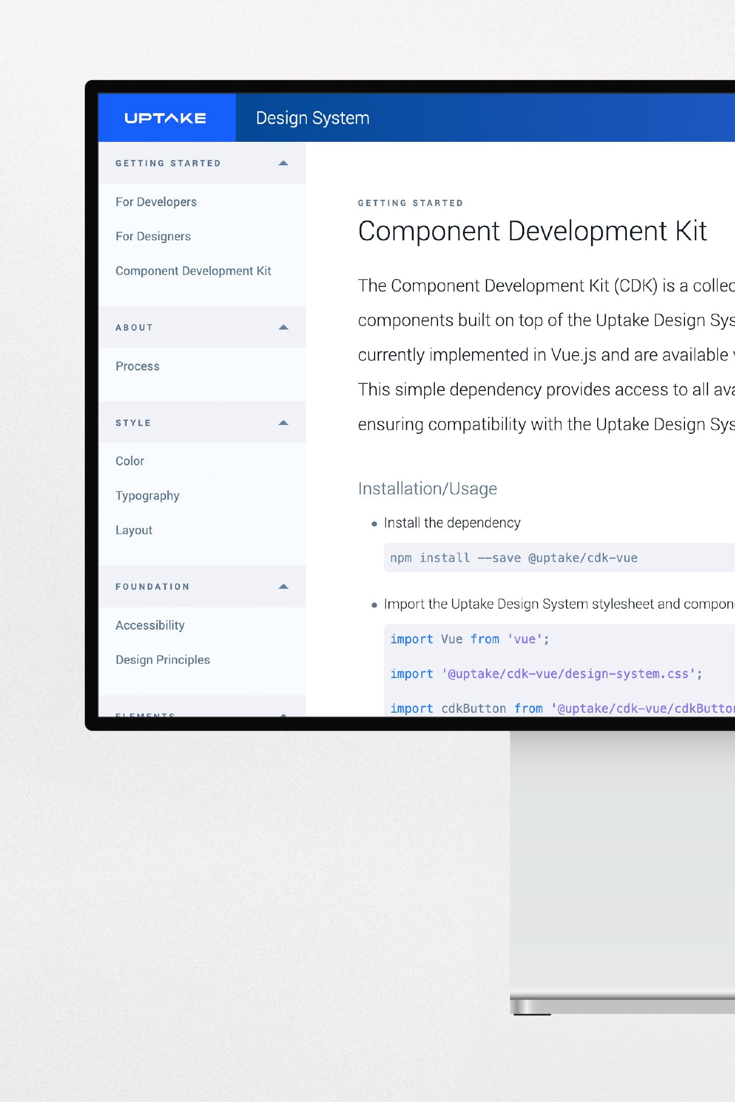
To disseminate our work on the design system to the product teams, we constructed an online documentation site encompassing our efforts on elements, components, patterns, templates, along with essential documentation and code. This documentation site served as a centralized resource, allowing developers to access reusable parts through Vue, Angular, and React JavaScript libraries, thereby mitigating technical debt.

Design System Documentation Site Map

Design System Documentation Site Wireframe
The homepage of the design system site showcases the key components and the team's design philosophy, articulated through design principles.
The Uptake Design System employs a range of font sizes for display, headings, and text, utilizing four font weights—thin, light, regular, and bold—based on their respective usage.
Uptake's color palette has been carefully selected to accommodate two themes—light and dark—while also adhering to WCAG Level AA compliance standards.

The Uptake Design System allows for seamless interchangeability between light and dark themes, enabling users to effortlessly switch and observe how components function across both themes.
The Uptake Design System incorporates four types of buttons—Primary, Secondary, Neutral, and Flat—each encompassing four variants: Action, Action + Icon, Menu, and Combo. These buttons come in three different sizes: Micro, Base, and Hefty, serving to guide users through various tasks and workflows.
Uptake data tables are available in two types—Static and Analytic. These tables effectively organize and provide meaning to data, presenting multiple items within a single component while ensuring that the information remains easily readable at a glance.

Data visualizations within Uptake's Design System empower users to extract valuable insights from substantial amounts of information. These tools effectively communicate metrics that hold particular significance to users.
Design System Adoption
To promote the adoption of the design system among company product teams, we implemented a tiered approach. Teams had the option, though seldom exercised, to opt out of adopting the design system. They could include stories in their backlog for implementation, opt to adopt only the visual style, or choose to utilize both the core components and the entire library. This flexible approach ensured, at the very least, an improvement in the visual and user experience cohesion of our products. Simultaneously, it aided in reducing technical debt and contributed to cost savings for the company by allowing a focus on more intricate problems.

Tiered approach to design system adoption.

The design system adopted by the energy product.