

Rider Dickerson More Than Ink Promotion
Art Direction ∙ Campaigns ∙ Package Design ∙ Print
"More Than Ink" is a promotional piece for Rider Dickerson, built around one idea: they do a lot more than printing. The package folds into an origami shape based on the ">" symbol, with custom perforation — and unfolds into a full-size color poster demonstrating different printing processes and finishes across a range of paper stocks.
Designed at Faust
Showcasing more than just their printing techniques, this custom perforated package allows the user to unzip a unique surprise.

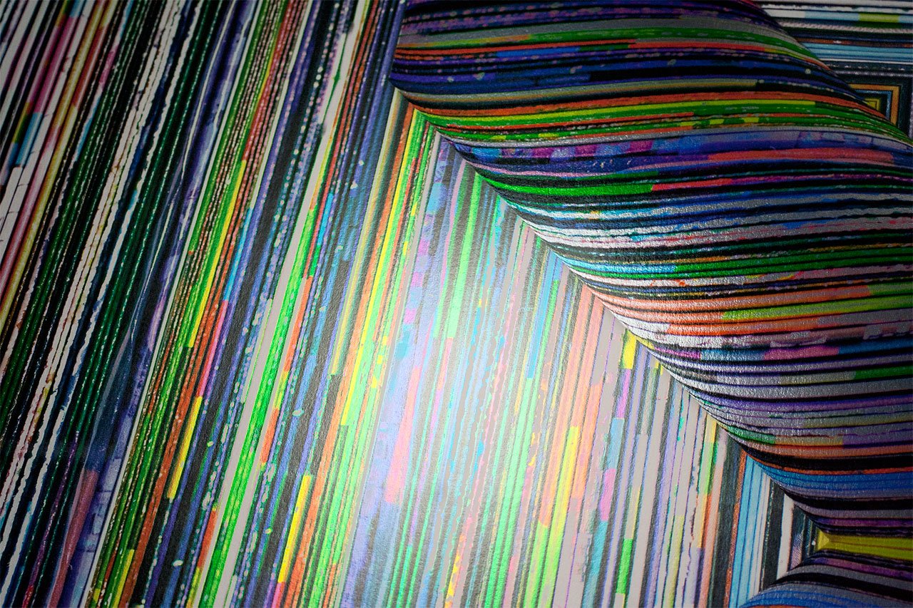
The inside of the poster was created from stacks of photographed recycled press proofs.

No fold is too complex for Rider Dickerson's capabilities.


The Rider Dickerson logo gets the perforated treatment.
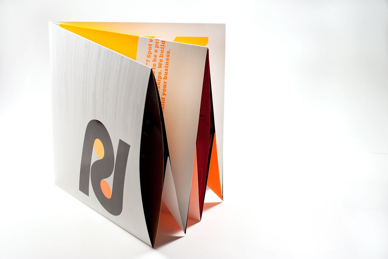
Origami inspired folding houses informational capability sheets.


The more than symbol finds its way into the fold as well.

